

The Light that Reveals
See Through the Manipulated Internet
A mountain range illuminated from behind, familiar at first glance. But the peaks warp and the ridgelines shift, revealing a landscape that has been quietly reshaped. The ability to see beyond the surface and uncover what is intentionally obscured.
Colors
Clarity, contrast, and controlled emphasis.
Neutral tones provide a stable foundation for content and interfaces, while the purple range introduces depth and focus. The accent color is used sparingly to highlight key elements and guide attention, ensuring that emphasis remains intentional and never overwhelming.
Cool Grey - Dark
#171717
23, 23, 23
Warm Grey - Light
#E8E8E8
232, 232, 232
Purple - Dark
#2B2195
43, 33, 149
Purple - Light
#B5B1ED
181, 177, 237
Salmon
#FE8F87
254, 143, 100
Dark mode first
The PeakMetrics color system is built on a dominant dark foundation, ensuring clarity, focus, and visual stability across interfaces.
Structure and depth
Neutral tones provide structure and support, while the purple range is used selectively to introduce depth, hierarchy, and emphasis.
Controlled accent
Accent color is applied sparingly to highlight key moments and guide attention without disrupting the overall balance.
Typography
Disciplined, contemporary, and quietly confident.
Primary Typeface
AKKURAT PRO
Chosen for its neutrality, precision, and enduring clarity. Its design is rooted in functional modernism, allowing information to be communicated without distraction or stylistic excess. In regular weights, it supports readability and consistency across interfaces. Bold is used for titles and key moments of emphasis, introducing hierarchy with restraint rather than contrast.
Wordmark
PeakMetrics
All caps with extended 31% letter spacing to reinforce clarity, structure, and confidence. The uppercase treatment establishes a strong, stable presence, removing ambiguity and emphasizing authority, while the tracking introduces openness and rhythm, allowing each letter to breathe and be read with ease.
Tagline
See Through the Manipulated Internet
The brand tagline captures the core promise of the platform. It should be used as a complement to the logotype in hero placements, campaign materials, and brand-level communications where the full value proposition needs to land in a single line.
Logotype
A distinct and recognizable identifier.
The logotype relies on letterform, spacing, and proportion to convey personality and ensure clarity across applications. Consistent use ensures visual coherence and reinforces recognition across all brand expressions.

Primary logotype
The primary logotype is the default representation of the PeakMetrics brand and should be used in all standard applications. It is designed for use on light backgrounds, where it achieves optimal contrast and legibility while preserving the integrity of its form.
Download

Primary inverse logotype
The primary logotype is the default representation of the PeakMetrics brand in outlined form for dark surfaces, where it achieves optimal contrast and legibility while preserving the integrity of its form.
Download

Flat logotype
A simplified representation designed for applications where reduced visual complexity is required. Typical applications include favicons, mobile interfaces, data visualizations, internal dashboards, print production, and low-resolution or single-color outputs.
Download

Flat inverse logotype
A simplified representation for use on dark backgrounds. Optimized for situations where simplicity, contrast, and reliable reproduction are essential across dark mode interfaces, dashboards, and single-color outputs.
Download

Black logotype
A monochromatic representation of the mark. It ensures the brand remains clear, controlled, and recognizable regardless of medium or limitation.
Download

White logotype
The white logotype is used on dark backgrounds where the primary logotype does not provide sufficient contrast. It maintains the same proportions, structure, and spacing as the primary version, ensuring consistency across all applications.
Download
Isotype
Recognizable at a glance.
A symbolic representation of the brand that functions independently from the logotype, designed to communicate the essence of the brand through form alone.

Primary isotype
For light surfaces.
Download

Inverse isotype
For dark surfaces.
Download
Brand imagery
A landscape that rewards a second look.
At first glance, the visual reads as a familiar mountain range -- calm, natural, stable. But look closer and the terrain begins to shift. Peaks warp. Ridgelines bend in ways nature wouldn't produce. The distortion is quiet enough to miss, and deliberate enough to unsettle once you see it. That tension is the point: PeakMetrics exists because the information landscape looks normal on the surface while something underneath has been reshaped. The brand imagery carries that same promise -- what appears ordinary reveals something deeper when you pay attention.

Mountain illustration
The base illustration without gradient overlay. The subtle warping of the landscape is intentional -- an environment that feels real until you look closely enough to notice the distortion.

Gradient overlay
The light that reveals the greater peak. Paired with the mountain, the gradient introduces the illumination that makes hidden patterns visible -- the moment of clarity the platform delivers.
Merchandising
The brand across physical products and materials.
Merchandising refers to the application of a brand across physical products and materials. It ensures that branded items consistently reflect the visual identity and maintain clarity, quality, and recognition in real-world contexts.
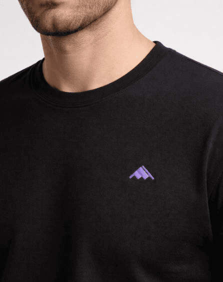
Apparel
The isotype in Purple - Light on dark garments. The mark should be placed with restraint, maintaining the exclusion zone and allowing the garment to carry the brand without overstatement.
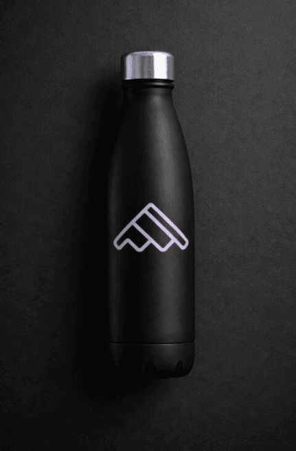
Accessories
The outlined isotype on a dark surface. For physical products where the mark wraps or scales, the outlined variant preserves legibility and brand recognition at any size.
Apparel
T-shirts, hoodies, jackets, and hats. Use the flat or inverse logotype depending on garment color. Maintain the exclusion zone around the mark.
Print materials
Business cards, letterhead, envelopes, and presentation decks. The primary logotype is the default; use inverse on dark stock or dark slide backgrounds.
Event materials
Banners, booth graphics, lanyards, and badges. Scale the mark proportionally and maintain minimum clear space of 2x the isotype height.
Digital accessories
Stickers, device skins, and packaging inserts. The flat logotype is preferred at small scales where detail would be lost.
Consistent application
Regardless of substrate or medium, all merchandising must use approved mark variants, adhere to the defined color palette, and respect the exclusion zone and proportion rules outlined in the logotype section. When in doubt, refer to the brand book for specific clearance and sizing guidance.
Usage guidelines
Preserve the clarity and integrity of the identity.
To preserve the clarity and integrity of the PeakMetrics identity, the logotype must always be used as defined. The following applications are not permitted.
Do not stretch or compress the logotype.
Do not alter proportions or spacing.
Do not rotate or skew the logotype.
Do not change the logotype colors outside of approved versions.
Do not apply gradients, shadows, outlines, or effects.
Do not place the logotype on visually busy or distracting imagery.
Do not recreate or modify the logotype.
Do not combine the logotype with other graphic elements or marks.
Do not use unapproved variations or outdated versions.